The Trend Explained

Tag: Form

  • The Trend Explained

    The Trend Explained

    The Trend is an incredibly useful tool from the TrackMate rating system. Quickly analyse the Rating profile of all contenders in any race. If your potential selection is improving, declining or consistent in it’s performances you will be able to spot this in no time at all.

    Here are the features explained on this page:
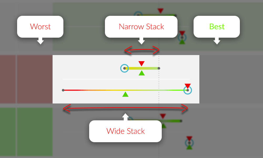
    Sample Trend - TrackMate
    Example “Trend” – Showing trend points, Speed Rating and EDGE Ratings.

    Trend Line

    The TrackMate Trend is a visual representation of the horses ratings to date. This makes it easy to spot form of an improving, consistent or declining contender. Incredibly useful for spotting runs that are “Out of character”
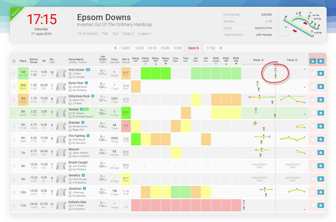
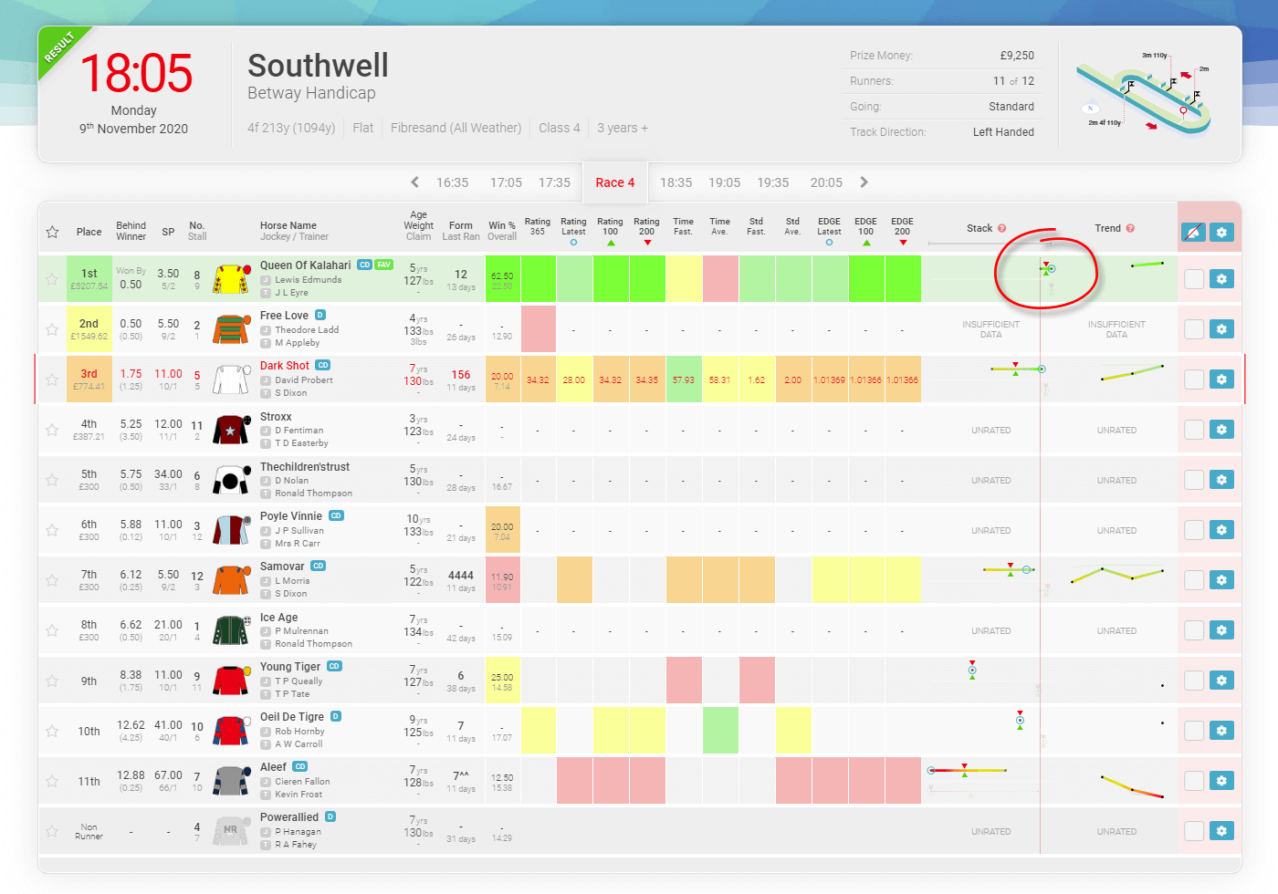
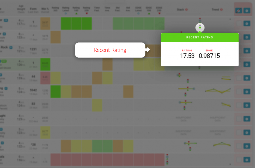
    Trend Points

    Each trend point represents a run with the first rated run being the dot furthest to the left. Information for each race is available by clicking these points/dots.

    How to read the Trend

    The trend displays each horse’s form in the horizontal graphical line or “trend line“. It has been designed so you can easily and speedily ready form. Utilizing an easy to read graphic which clearly shows if the horse’s form is improving, declining, consistent or inconsistent.

    Improving Trend

    When the horizontal trend line is going upwards this is what we refer to as an “improving tend” meaning the result was better than the previous race.

    Declining Trend

    When the horizontal trend line is going downwards this is what we refer to as a “declining tend” meaning the result was worse than the previous race.

    Consistent Trend

    When the horizontal trend line doesn’t go up or down very much this is what we refer to as a “consistent tend” meaning the results are pretty similar. This can be true for part of the line, but the greater proportion represents greater consistency.

    Inconsistent Trend

    When the horizontal trend line goes up and down a lot then this is what we refer to as a “inconsistent tend” meaning the results are erratic. This can be true for part of the line, but the greater proportion represents greater inconsistency.

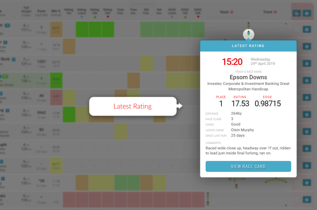
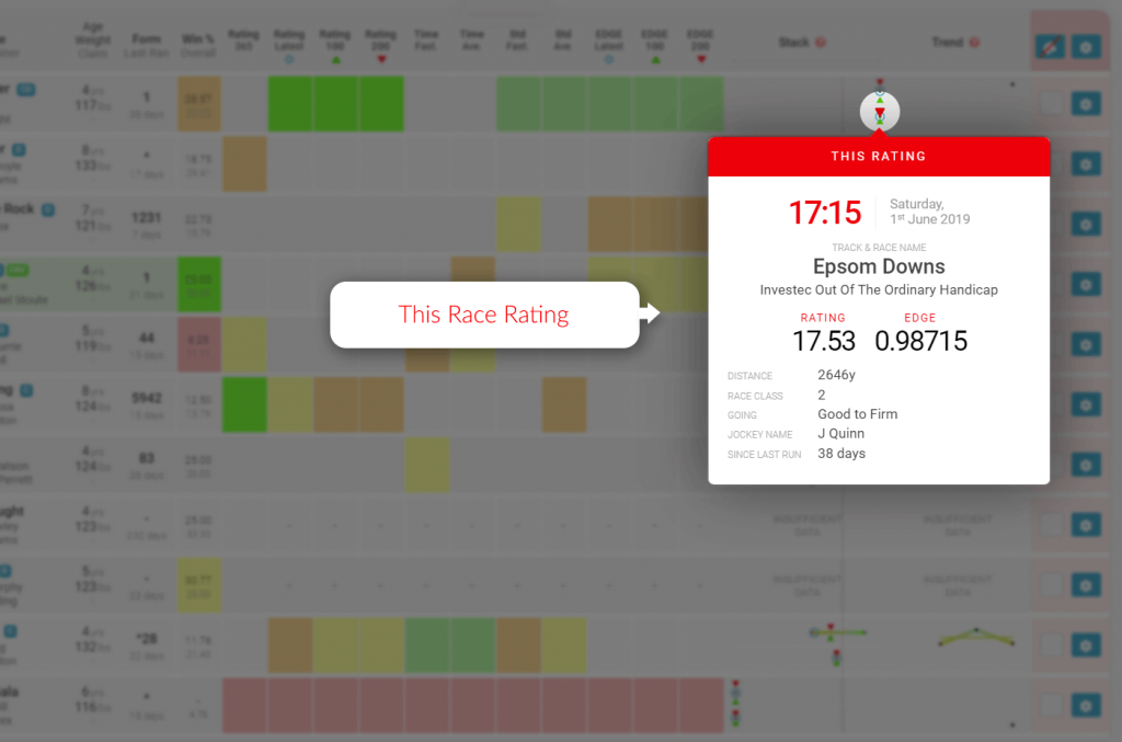
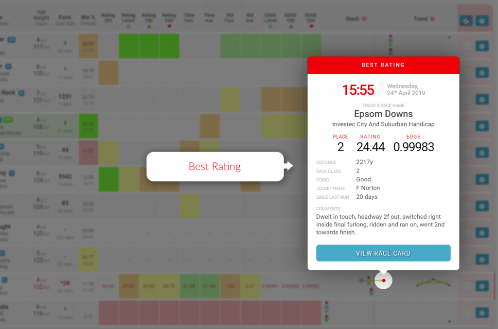
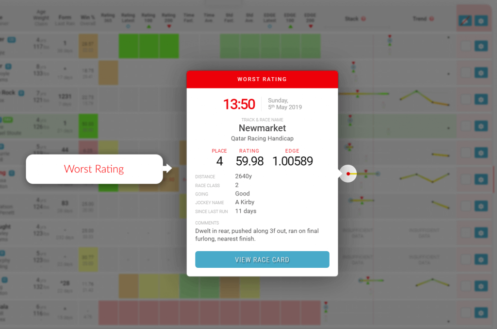
    Trend Point Information Popups

    Each dot or “trend point” represents a race that the horse has taken part in. On hover these points will change to red dots and when clicked will open the information popups.

    Samples Trend Popup - Trackmate
    Sample Race Card Trend Popup

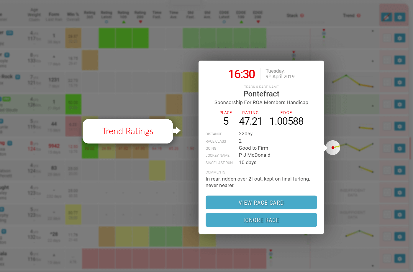
    By clicking on these points you will see a popup with all the details of that particular race. You will have all the information you need; race conditions, race distance, jockey and many more including TrackMate Speed and EDGE ratings achieved for that run.

    Ignore Race Feature

    One of the great features of the TrackMate race card is the ability to “ignore” any of the horses runs for any reason you may have.

    Samples Trend Popup - Ignore Race - Trackmate
    Sample Race Card Trend Popup – Ignore Race Button

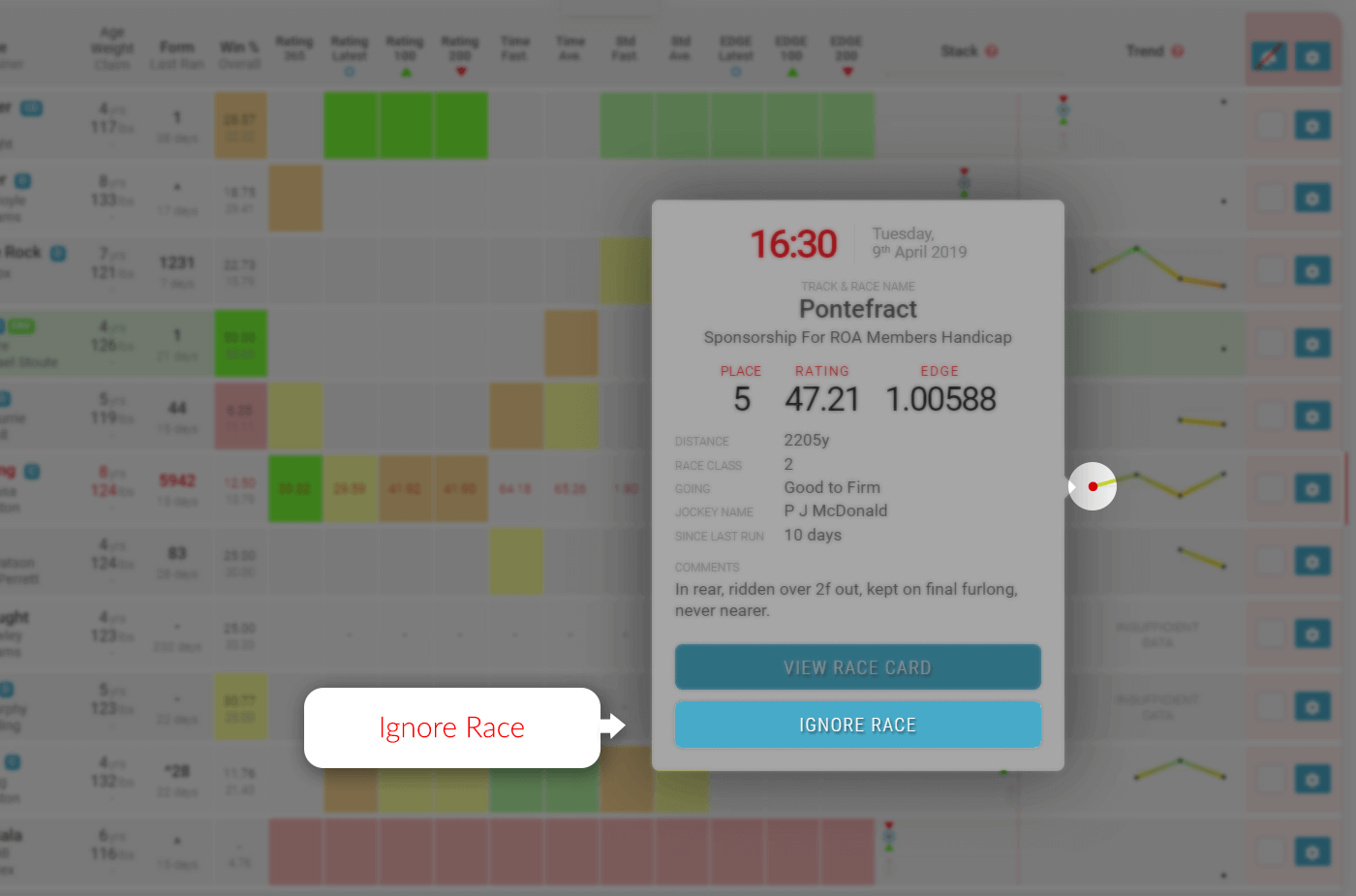
    If you decide that you are prepared to forgive a bad run or you know that the race distance just didn’t suit the animal or even if you think the jockey was no good in that race. Just click the trend point and then remove race from the popup.

  • The Stack Explained

    The Stack Explained

    One of the most exciting features of the TrackMate rating system is the stack. An incredible tool for the speedy analysis of the ratings in relation to the other runners in the race. It has many uses and can be an incredibly powerful tool when analysing races. There is a stack for both sets of ratings on every race card.

    On this page you will find explanations for the following:

    The “Stack” is a graphical representation of each horse’s range of performance from the qualifying form.

    • The top stack is speed ratings and is a thicker line.
    • The bottom stack is EDGE ratings and is a thinner line.

    Both stacks have the same rating markers for each horse’s qualify form.

    Sample Stack - TrackMate
    Sample “Stack” – Showing 100, 200 and most recent ratings and the range between worst and best.

    Range of Performance

    The narrower the line is, the more consistent the horse has been as the range between worst and best is less.

    The wider the line, the less consistent the horse has been as the range between worst and best is greater.

    Worst Rating

    The dot on the far left of each horizontal line is the horses worst rating for the qualifying form period.

    Best Rating

    The dot on the far right of each horizontal line is the horses best rating for the qualifying form period.

    100 Day Rating Icon

    The green triangle is the average speed rating for qualifying races for the last 100 days.

    200 Day Rating Icon

    The red triangle is the average speed rating for qualifying races for the last 200 days.

    Latest Rating Icon

    The blue circle is the rating for the last qualifying race.

    Vertical Guide Line

    There is a vertical guide line feature that appears when you hover over the grey guide bar under the stack column title. The line will be red when active as you move left and right over the guide bar. It will then stop moving and change to a grey dotted line when you move off the guide bar.

    This line is extremely useful to get a vertical comparison between all runners stacks in the race making it easier to visualise where the stacks and icons are in relation to each other.

    Great Stacks

    The stack can identify opportunities where horses could be deemed as well above the standard of the rest of the field.

    Here are two example of how to identify a “great stack”

    “Great Stack” Example 1 – 1st June 2019, Epsom Downs at 5:15pm

    In this example 1, you will clearly see that the stack for Soto Sizzler indicates that his form is way out in front of the rest of the field in both Speed and EDGE ratings.

    Sample Great Stack - 2020-11-09 Southwell at 18.05 - TrackMate
    “Great Stack” Example 2 – 9th November 2020, outhwell at 6:05pm

    You will see in example 2 that Queen Of Kalahari’s “worst” run is as good as any of the other runners “best” run and its best run is clearly best of all.

    The stack can also be used to find “poor value” horses and opportunities to “Lay” horses on the exchanges.

    Stack Point Information Popup Examples

    Latest Rating (blue circle)

    Samples Stack Popup - Latest Rating - Trackmate
    Sample Stack Point Information Popup – Latest Rating

    100 Day Rating (green triangle)

    Samples Stack Popup - Recent Rating - Trackmate
    Sample Stack Point Information Popup – Recent Rating

    200 Day Rating (red triangle)

    Samples Stack Popup - This Rating - Trackmate
    Sample Stack Point Information Popup – This Rating

    Best Rating (far right dot)

    Samples Stack Popup - Best Rating - Trackmate
    Sample Stack Point Information Popup – Latest Rating

    Worst Rating (far left dot)

    Samples Stack Popup - Worst Rating - Trackmate
    Sample Stack Point Information Popup – Latest Rating